
Gate Card

Gate Card is a crypto debit card launched by Gate, supporting both virtual and physical cards. It can be used at over 80 million merchants worldwide and enables global online and offline spending with crypto assets. I joined in mid-2024 and led the design and related redesign initiatives.
Following my NDA, I've revised any sensitive info in this case study. What you read here comes from my own insights and might not exactly match company's stance.
Senior Product Designer
2024.10 - 2024.12 (2 month)
Figma

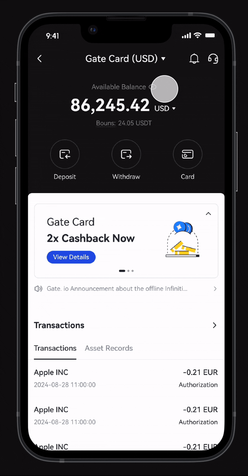
Through team & user interviews and competitor analysis, I found that use mainly access the management page via mobile but face low engagement and drop-offs. They struggle to locate features, miss key info during top-ups, and expect smoother navigation.
Our competitors address this by showing balances, card promotions, and spending history—highlighting the need for a consistent interface.

Unify multiple cards under a shared interface to deliver a consistent user experience.
Optimize the information to make core features easier to find and reduce steps.
Enhance the visual management interface and ensure the flow of funds is transparent
By reorganizing the page hierarchy and concentrating on key elements, we made the main page more accessible. Centralizing entry points led to a smoother, more seamless navigation experience for users.

I began by grouping similar features and information, working with product managers to identify and remove unnecessary elements. By prioritizing frequently used functions, I ultimately separated the main management page from the card management page, resulting in a clearer and more streamlined experience.

Collaborating with the product and operations teams, I tested homepage layouts and we selected the design that showcased key strengths, leaving room for future premium card expansion.


Copyright © Janet Yeh Design 2025